Redesigning the OCI Compartment Selector for Clearer Navigation and Faster Workflows
Project Summary
I redesigned the Oracle Cloud Infrastructure (OCI) Compartment Selector to make navigating complex environments faster and more intuitive for customers. My work focused on improving discoverability, reducing friction in selection flows and ensuring the design scaled across OCI services.
Results
Reduced navigation time and minimized errors when managing complex enterprise environments.
Skills:
UX Design, Re-Design, Design System Component and Pattern Implementation
Role:
Lead UX Designer
Team:
SMEs, UI Developers, UX Researcher, UX Designer
User Problem
Security and networking admins rely on compartments to organize and secure cloud resources. When compartments are difficult to locate or unclear, users lose confidence, waste time navigating and risk misconfiguring resources. The existing design left users disoriented and slowed their ability to manage resources effectively.
Usability Issues
Hard-to-find compartments: Poor placement and visibility made it difficult for users to locate the right compartment, creating delays and frustration.
Lack of current compartment indication: The absence of clear indicators of the active compartment leads to disorientation and potential errors.
Impact
These challenges increased confusion, slowed task completion and introduced risk of mismanaging critical resources, undermining both efficiency and trust in the platform.
The Process
- Requirements gathering
- Competitive analysis
- SME interviews
- User flows
- Collaborative brainstorm and ideation
- High fidelity prototyping
- User testing and validating
- Development handoff
- Contribute back to design system
Phase One
I partnered with a UX researcher, developers, and a lead product manager to:
- Uncover customer pain points.
- Understand the entire workflow of working with compartments.
- Explore the capabilities of the API and identify areas for expansion.
Competitive Analysis
Analyzed competitors such as AWS, Salesforce and Microsoft Azure to identify patterns in folder structuring.
SME Interviews
Set up internal user interviews to get a better understanding of how they utilize compartments. Conducted internal user interviews to gain a better understanding of how they utilize compartments and uncover what is working and what is not.
Identify Users
All customers who navigate Oracle Cloud Infrastructure console; including security and networking architects, security and networking admins.
Pain Points
- Compartments are the primary way to secure and navigate resources; however, in the UI, they are not treated as such. Users struggle with locating and managing compartments, leading to frustration.
- The lack of clear indication of the current compartment disorients users and makes it difficult for them to understand which compartment they are working in.
Before - Placement of compartment is disconnected, lacking a clear indication of current compartment.

Identify Constraints
- Our findings from user studies influenced the layout of the newly designed list and detail pages, requiring close collaboration with the UX design team working on the redesign.
- API limitations were a key consideration in our findings.
- Developing a new component for the design system because it lacked a method for hierarchical searching in a dropdown menu.
Goals
After our initial research and interviews with internal users and SMEs we focused on the following goals:

Phase Two
Brainstorming and Design iterations
Working with fellow UX designers, I facilitated brainstorming sessions to collaborate on ideas for the compartment selector's location, functionality, and design.
I led the team as we created rapid design concepts using the components and templates from our design system.
After selecting key designs that aligned with our goals, I worked with a UX researcher to test the concepts.


User testing with high-fidelity flows
Working closely with a user researcher with the goal of determining which style and position worked best, we planned both live moderated and unmoderated UserZoom click tests.
After developing a script and outlining key questions for users, live sessions were held to gain deeper insights into the user experience.


Click testing results (44 respondents)
- A majority of users chose the compartment next to the resource name as a suitable location (45% of respondents).
- In the engineering team’s discussions during the survey, it was determined that having compartment select next to the header would not be feasible, so designers changed the direction to have the compartment select next to the search bar, which was selected as the second choice (32% of respondents).
- The new direction was later validated through user interviews.
User Interviews (5 internal experts)
- All users reported that having the compartment selector separated but placed next to the search bar made the most sense from both a style and behavior perspective.

Results and Impact
The improved design and placement of the compartment select navigation resulted in a more intuitive experience and increased user satisfaction.
- The location of compartment select influenced the final re-design of tables throughout all of OCI console.
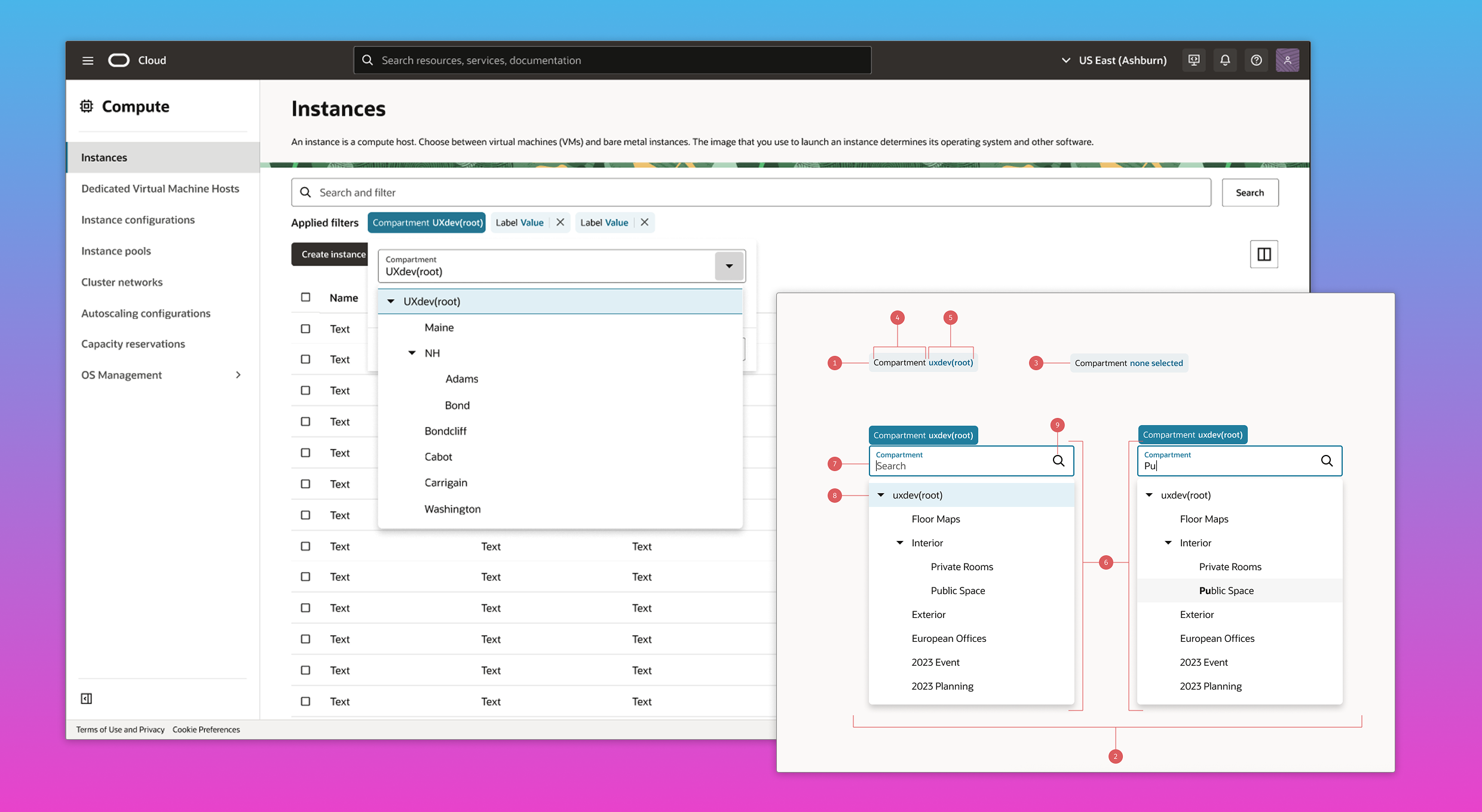
- The compartment selector is a permanent filter chip next to the search bar, serving as the first filter users need to select. It defaults to the root folder, so users aren’t prompted to select a compartment each time.

- Our engineers built out this component as a custom component and we contributed it back to our design system.
- The hierarchical dropdown selection was also contributed back to our design system to be utilized in forms across the console.

Future roadmap planning
Leveraged user testing and research insights to shape the future roadmap for component redesign
- Advocated for enhanced functionality, including multi-compartment selection and "select all" capabilities.
- Explored opportunities to integrate compartments with tenancy or region selectors for a more seamless user experience.
