Empowering Oracle Cloud Infrastructure Customers with Interactive Data Visualizations for Better Decision-Making
Project Summary
I led the redesign of Oracle Cloud Infrastructure’s (OCI) data visualization framework, enabling customers to transform complex cloud data into clear, actionable insights.
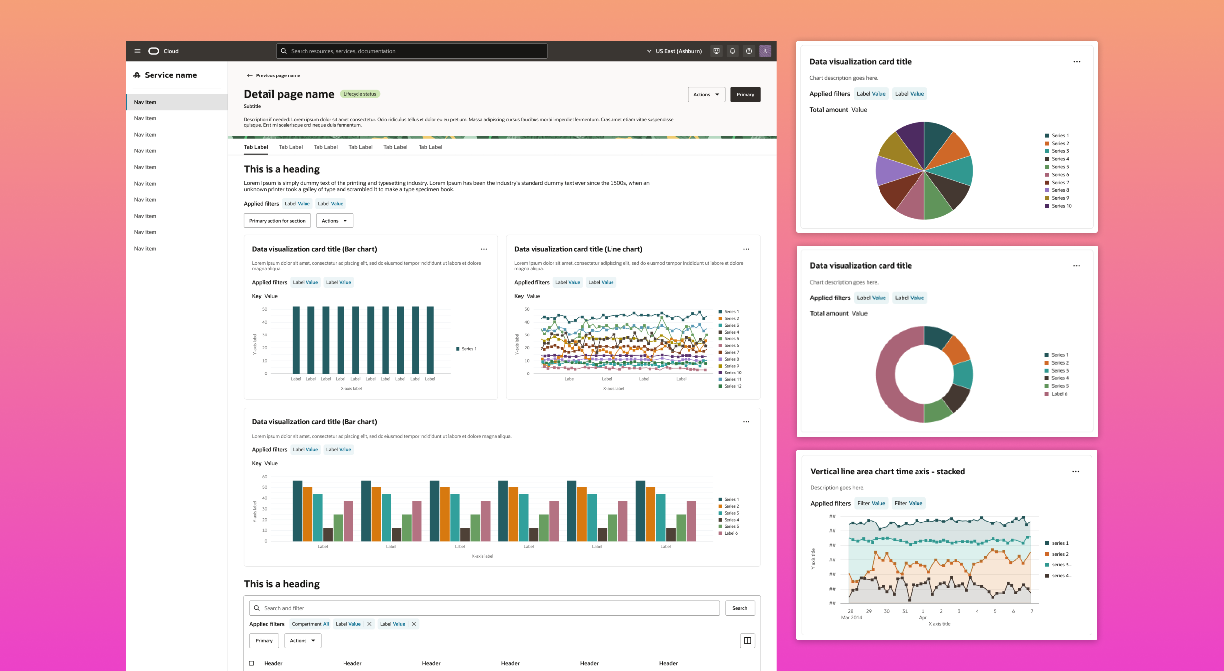
The expanded data visualization library introduced seven new, accessible chart types, including area, donut, pie and mixed line/bar charts, each tailored for cloud-specific use cases.
My work focused on simplifying information presentation, ensuring visualizations were interactive, scalable, and aligned with real-world decision-making needs.
Results
The new data visualization library improved consistency and clarity across dashboards, reduced design debt, and enabled teams to scale data visualizations more effectively, helping customers surface the most important data and take timely action.
Skills:
UI Design, Design Systems, Design Guidelines, Data Visualization
Role:
Lead Principal UX Designer
Team:
Product Managers, 2 UX Designers, UI Developers
User Problem
Users relying on dashboards struggled to quickly interpret critical information and act in time. Inconsistent and unclear data visualizations across teams made it harder for them to identify trends, prioritize issues and make confident decisions. At the root of this was a lack of standardized charts and shared guidelines within the design system, which led to fragmented designs and design debt.
Usability Issues
Limited chart types: With only two chart options available in the design system, users were constrained in how they could visualize data, making it harder to uncover insights or represent information in ways that matched their needs.
Inconsistencies across services: Variations in chart design and behavior across OCI services created confusion and a steep learning curve, slowing users as they transitioned between dashboards and tools.
Lack of advanced functionalities: Charts lacked interactive features and customization options, limiting users’ ability to explore data, drill into details, and perform in-depth analyses efficiently.
Impact
These usability challenges resulted in increased cognitive load, reduced efficiency in data interpretation and a diminished user experience, particularly for those relying on data visualizations for critical decision-making processes.
The Process
- Analyze current usage of charts
- Gather customer feedback tickets
- Analyze Oracle Redwood’s charts and graphs
- User flows
- Low fidelity user flows
- High fidelity prototyping
- Development handoff
- Product launch
- Feedback and iteration
Phase One
- Analyze all existing OCI services that use charts and graphs.
- Gather and analyze Jira tickets from services requesting improvements.
- As part of the overall redesign process, review Oracle's Redwood design system's charts and graphs to assess what they offer and what they lack.
- Research chart types and recommended usage.
- Collaborate with product management and engineering to propose a design plan for different phases.
- Prioritize key services for a multi-phase approach.
Analysis of existing charts and graphs usage across Oracle Cloud Infrastructure

Phase Two
Design iterations
After analyzing existing charts, customer needs, and Redwood’s library to inform design decisions:
- Led design iterations to define chart types, key functionalities and user-friendly interactions.
- Developed extended color palettes, ensuring consistency and accessibility across teams.
- Designed chart containers, page layouts and filtering mechanisms for seamless integration into forms and pages.
High fidelity design iterations

Phase Three
Final product
- A comprehensive addition of 7 chart types, enhancing the ability to visualize customer data.
- Flexible chart and card layouts to meet the needs of all OCI services.
- Multiple color palette options for services requiring risk highlighting.
- Guidelines, reusable components, and templates to help designers get up and running quickly.

Results and Impact
These additions solved the lack of coverage in the existing library, giving teams the right tools to represent complex data accurately.
By standardizing chart options within the design system, adoption improved dashboard consistency, reduced reliance on third-party solutions and shortened implementation time.
For users, this meant dashboards were easier to read, insights were clearer and more actionable and critical data could be surfaced faster to drive timely decisions.
Internally, teams benefited from smoother collaboration, reduced confusion and a noticeable drop in design system support tickets.


